I’ve updated the header on this site for one day to mark it.
The chart above shows how temperatures have varied from the average across the whole of Scotland from 1884-2023. It’s fairly apparent what’s happening.
In my experience, service design is mostly about telling – and selling – stories.
Telling the stories of people we’ve met through user research. Understanding what makes life difficult for them, and adjusting our approach to accommodate what they need.
Telling these stories helps us make sure our UX designers and developers and content designers can update our services in ways that accommodate those needs. And mostly, that works out fine.
But sometimes, we have to sell a story.
Selling a story
When we sell stories, we’re talking about the future. Where we want to be in 6-12-18 months. A possible future.
I watched a webinar earlier today about creating inclusive personas to encourage accessible, human-centred design. The instructors talked about the disabilities people have, the assistive technologies they use, and how to create inclusive personas that describe those needs.
A portrait we used in one of our personas. This is a real person, who we’ve supported. No AI, no stock images.
And that’s all great, and laudable. But, with all my experience, I am not convinced it’s always the right approach.
I’ve been working on a project lately with a small team and a similarly select group of Scottish Enterprise account managers to create a slicker way of bringing businesses into their portfolio.
It’s a bit of a pathfinder project, to figure out how we might use Microsoft Power Platform technologies to deliver new services at scale and at speed.
So we settled on this one aspect of our High Growth account managers’ service to start with: getting new clients onto their portfolio.
The solution we’ve developed involves Power Pages (client-facing) and Power Apps (backend) developments, both reading from and writing to the same database, and all of this data is ultimately available in our CRM system.
All of which is fine. But, as a Service Designer, I instinctively want to be open and transparent about the data we gather. And the Digital Service Standard kinda demands that we are.
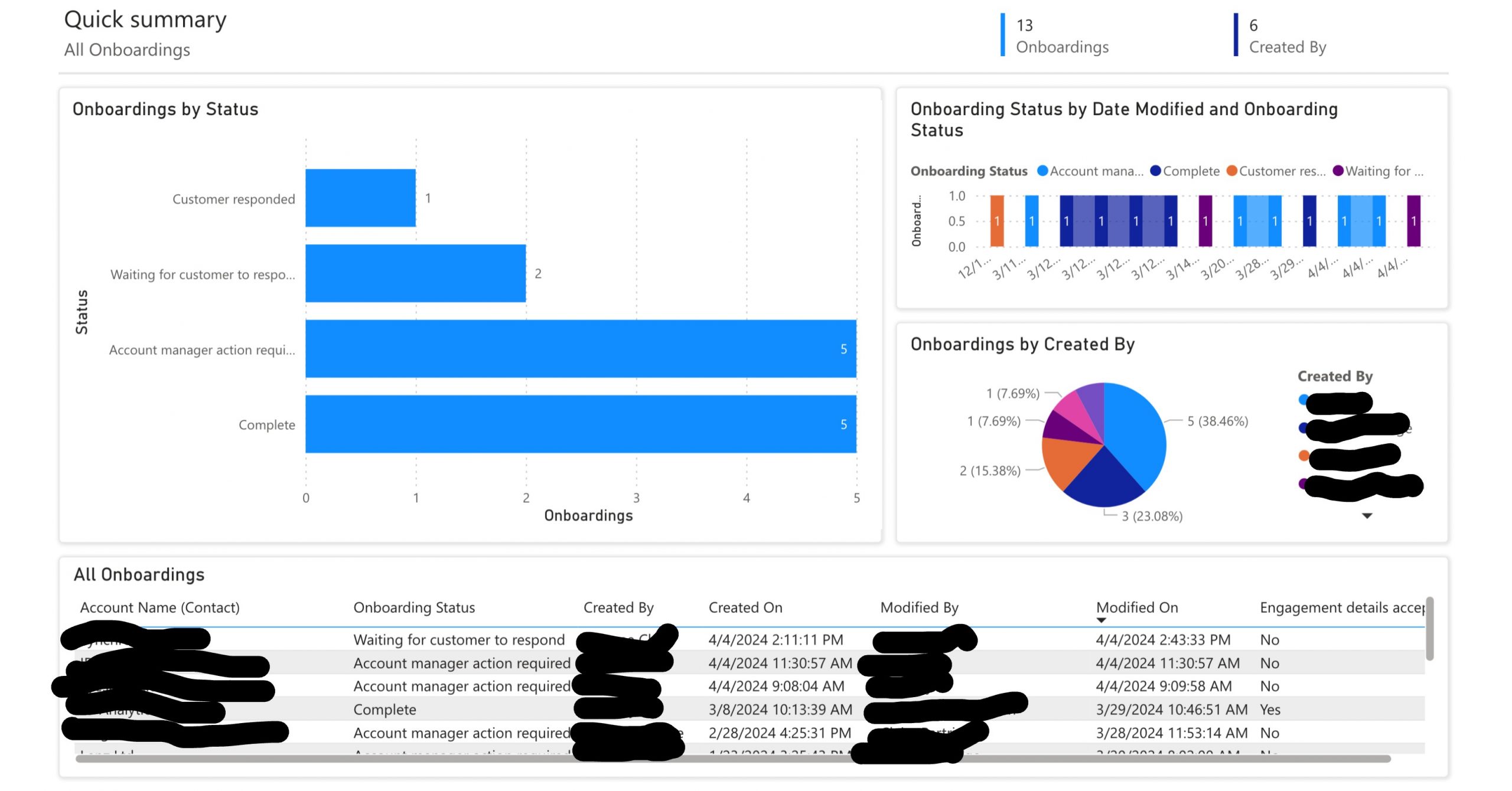
I struggled with this for a while. I wrestled in the swamps of the Dataverse against PowerBI, and the best I could come up with was this:
Figure 1: screenshot of a Power Bi dashboard taken on 4 April 2024
(Actual people’s actual names have been scrubbed out in this screenshot because they’re actual people. But all the data is real, and right now.)
Our logo was updated, and our typefaces and colour palettes changed.
I’m not a marketer, so that’s not my domain and I have nothing to say about that.
But I am a designer. And, when you’re designing communications material, whether it’s a website, an app, a brochure, a poster, a letter … these things matter. They are constraints you have to design within.
And yet, you have to produce an experience that’s accessible.
Ahead of our migration of the Scottish Enterprise website to our new design system, the User Experience (UX) team wanted to make some improvements to the information architecture of the site.
First of all, what do we mean by information architecture?
Information architecture, or IA, can mean different things to different people. To some it’s the sitemap, to others it’s the main navigation, to others something more abstract.
According to the UX experts at Nielsen Norman, information architecture is both a noun and a verb, referring to both:
“The practice of deciding how to organize and maintain your content, what the relationships are between each piece of content, and how content is visibly displayed on your website’s navigation”
and also
“The website’s structure, its organization, and the nomenclature of its navigation elements. The website’s IA refers to how information is organized, structured, and presented on that website.”
As a service designer, a large part of my job is making sure everyone on the project sees and understands the same picture.
We all need to have a shared understanding of:
why we’re here
what we’re trying to do
the outcomes (changes in the real world) we want to see
That sounds easy, but in reality it’s not. Everyone has their own perspective: designers, developers, content designers, architects, security people, product owners … everybody comes at the problem with their own priorities and experiences, their own preferences, language, biases and assumptions.
We can have hours of discussions and endless workshops to thrash these conflicting worldviews and languages out. Thousands of unmourned post-its may be lost in the process.
So one day, back in 2019, when I was working on the very early days of findbusinesssupport.gov.scot I decided we needed an authoritative way to describe and demonstrate our purpose.
In my experience at that time, it really helps to have a big reminder of “this is why you’re here” every time you enter the workplace. (It was ‘real’ then, it’s (mostly) virtual now.)
I had an interesting conversation today with a couple of colleagues from VisitScotland. They had come across our web estate carbon calculator, and were interested in replicating our approach.
I had already indicated in the response to the invitation that I had reservations about how useful this approach is. So it was an interesting chat.
I’m not actively involved with the findbusinesssupport.gov.scot team any more. But it’s still a service close to my heart.
I was part of the team that designed and built it in the midst of a global pandemic. And which suddenly learned, unwarned, that we would be the primary vehicle for the Scottish Government’s response to the emergency for businesses.
We were still in Beta in March 2020, so we were just routinely publishing all the data we had about usage. But, as we – de facto, if not officially – became a production service due to necessity, we just continued to do so.
To get best results you need to take all your project team with you.
Sometimes the most difficult part of the research process can be getting full buy-in from the project team. This can be especially true when the team have strong opinions on what needs to be done and the research is contradicting this. This can lead to conflict and the validity of the research being questioned. However, there are ways to bring the project team with you and get their buy-in and support at every stage of a project. Let’s explore these.
That means it’s (probably) now the de facto default against which your website or apps will be judged if a case is brought against you.
Although I would guess most jurisdictions will give you 6-12 months to catch up, depending on the scope of your organisation.
Update your accessibility statements, if you need to. Basic standards are still:
Perceivable
Operable
Understandanle
Robust
Under the hood, not much has changed. Biggest updates are on :focus styles, and the visibility of focused elements. Oh, and authentication. Not being able to rely on cognitive challenges is going to be a big change for many organisations.
I rarely use twitter (I refuse Musk’s nomenclature) any more. There are more than enough fascists in real life.
But I saw some posts on Mastodon about how the site has removed headlines from links to news sites. So thought I’d have a look.
The #a11y implications are terrible. There is no link text any more, just an aria-label attribute on an <a> element.
But these also have tabindex=”-1″ meaning, for keyboard users, you can’t focus links using the tab key.
Images have empty alt attributes.
Screenreader users can probably still find them by asking their AT for a list of links.
But many people navigate websites primarily with a keyboard for reasons other than blindness or low vision.
Although this was … not unexpected … it’s still just so disappointing. Twitter had a very good and very active accessibility team who did a lot of good work. They were all fired.
Twitter is degrading its #UX –intentionally – to fulfil the whims of an oligarch.
All online activity generates carbon emissions. Every image downloaded, every click, server call and visit to our site. These types of interactions generate Scope 3 emissions. Lowering these emissions helps Scottish Enterprise towards achieving our Net Zero targets. And, for our users, the user experience is improved, along with SEO, because pages load faster and they use less data interacting with our sites.
I recently ran a session with some of our content developers covering alternative text, and the difference between alt text and captions. It seemed to be well received, so I thought I’d write it up.
Modern web design includes a variety of techniques to provide text alternatives for non-text content. In this example, a <figcaption> provides additional context,
“Text alternatives” is the first guideline of the first principle of WCAG 2.1. It’s literally the first thing to think about – and the reason why is pretty simple: not everyone can see images.
That may be because they have a vision disability. But it could also be because the image has been deleted, renamed or moved. Maybe their network connection is poor. Or their browser doesn’t support the format. Or they have disabled images in their email client because they have a 500MB monthly limit.
Whatever. It happens. Text alternatives are what users rely on when images are not available. Like this one right here:
The alternate text needs to replace the image. So your question becomes very definite:
What text do I need to provide if this image is not available? How might I describe the appearance, purpose, function, or meaning of this image to someone who can’t access it?
In the run-up to January 2023 we migrated our first site – SDI.co.uk – to our new Design System.
SDI website
Just under 3 years of research, design, build and, finally, the migration of content from the old site to the new site. This is a huge milestone in the development and success of our future websites for Scottish Enterprise.
Polish your elevator pitch because it is more needed today than ever before.
How often do you talk to peers who just can’t tell you what their project exists to do. They can only tell you what they do on the project.
A friend of mine took on a new role at a finance company. When he started there were 40,000 defects in Jira.
When he left 2 years later….there were 40,000 defects in Jira..
He couldn’t tell what his project actually did.
So what was their team actually meant to do?
If you don’t know the Pitch then why is your company funding your project?
A good pitch is a way of telling your story that rolls together:
Problem statements
Solution Statements
A Hypothesis
Future state/vision
It does this in a No-Nonsense, Plain English manner.
So how do I create this magical Pitch you speak of
There are lots of ways to create a Pitch, but one that has never failed me in workshops is the Pixar Pitch. This is the structure that ALL Pixar movies use and to date they have raked in over 15 BILLION DOLLARS. So obviously not a bad approach to story telling.
I seem to have been running a lot of retrospectives lately. And yes, I just used an Oxford comma. Get over it.
In the sailboat retrospective format, the boat represents the project or work we are doing; the wind is what is pushing us forward, the anchor what is holding us back. The rocks are dangers/risks we face, and the island is the goal or destination. I created this template in Miro.
In case you don’t know what that means, a retrospective (or a ‘retro’ for short) is a meeting-come-workshop where you look back on work you’ve done, as a team, and try to identify ways you could be better in future.
In agile methodologies, you can hold retros pretty regularly. With Scrum, you’d hold one at the end of every sprint – typically every 2 weeks – so you can get feedback quickly and adjust course immediately.
Think guiding a canoe through rapids; if you can’t change course quickly, you are going to hit a rock (a fairly common metaphor for retros uses a sailboat, as above) pretty soon, and pretty fatally.
It started with a leadership course 14 years ago. It ended with a leadership course 1 year ago.
Somewhere in between I have spent almost 14 years working with the most talented, passionate people, and now my last day at Scottish Enterprise (SE) approaches.
It’s been the best of times, seeing what small teams of committed people can bring to work and to their relationships. It’s also been the most frustrating of times too. I can’t help but marvel at how I spent 3 years trying to move us over to digital signatures, but to no avail. Then Covid hit and boom, it happened. When the risk is high, politics is low.
But my time in SE isn’t just the last two very challenging years. It’s much wider than that and I’ve been reflecting on some of the things that cut through everything I’ve done. There are many but I’m going with just three things.
Applying for a job seems simple enough, right? Set out your own expectations on a job and employer, find something that meets your expectation and apply! However, in the 6 months I have spent with the service design team at Scottish Enterprise (pretty new right!) I have learned that very few things are as simple as we say or think.
Following several queries and concerns relating to our Current vacancies page on Scottish-enterprise.com, the team kicked off a project to research, understand and act on the needs of our customers (potential applicants) and colleagues (those involved in recruitment).
To provide the best experiences, we use technologies like cookies to store and/or access device information. Consenting to these technologies will allow us to process data such as browsing behaviour or unique IDs on this site. Not consenting or withdrawing consent, may adversely affect certain features and functions.
Functional
Always active
The technical storage or access is strictly necessary for the legitimate purpose of enabling the use of a specific service explicitly requested by the subscriber or user, or for the sole purpose of carrying out the transmission of a communication over an electronic communications network.
Preferences
The technical storage or access is necessary for the legitimate purpose of storing preferences that are not requested by the subscriber or user.
Statistics
The technical storage or access that is used exclusively for statistical purposes.The technical storage or access that is used exclusively for anonymous statistical purposes. Without a subpoena, voluntary compliance on the part of your Internet Service Provider, or additional records from a third party, information stored or retrieved for this purpose alone cannot usually be used to identify you.
Marketing
The technical storage or access is required to create user profiles to send advertising, or to track the user on a website or across several websites for similar marketing purposes.