Transforming public services to businesses in Scotland
David O'Brien
I'm a service designer in Scottish Enterprise's unsurprisingly-named service design team. I've been a content designer, editor, UX designer and giant haystacks developer on the web for (gulp) over 25 years.
I had an interesting conversation today with a couple of colleagues from VisitScotland. They had come across our web estate carbon calculator, and were interested in replicating our approach.
I had already indicated in the response to the invitation that I had reservations about how useful this approach is. So it was an interesting chat.
I’m not actively involved with the findbusinesssupport.gov.scot team any more. But it’s still a service close to my heart.
I was part of the team that designed and built it in the midst of a global pandemic. And which suddenly learned, unwarned, that we would be the primary vehicle for the Scottish Government’s response to the emergency for businesses.
We were still in Beta in March 2020, so we were just routinely publishing all the data we had about usage. But, as we – de facto, if not officially – became a production service due to necessity, we just continued to do so.
That means it’s (probably) now the de facto default against which your website or apps will be judged if a case is brought against you.
Although I would guess most jurisdictions will give you 6-12 months to catch up, depending on the scope of your organisation.
Update your accessibility statements, if you need to. Basic standards are still:
Perceivable
Operable
Understandanle
Robust
Under the hood, not much has changed. Biggest updates are on :focus styles, and the visibility of focused elements. Oh, and authentication. Not being able to rely on cognitive challenges is going to be a big change for many organisations.
I rarely use twitter (I refuse Musk’s nomenclature) any more. There are more than enough fascists in real life.
But I saw some posts on Mastodon about how the site has removed headlines from links to news sites. So thought I’d have a look.
The #a11y implications are terrible. There is no link text any more, just an aria-label attribute on an <a> element.
But these also have tabindex=”-1″ meaning, for keyboard users, you can’t focus links using the tab key.
Images have empty alt attributes.
Screenreader users can probably still find them by asking their AT for a list of links.
But many people navigate websites primarily with a keyboard for reasons other than blindness or low vision.
Although this was … not unexpected … it’s still just so disappointing. Twitter had a very good and very active accessibility team who did a lot of good work. They were all fired.
Twitter is degrading its #UX –intentionally – to fulfil the whims of an oligarch.
I recently ran a session with some of our content developers covering alternative text, and the difference between alt text and captions. It seemed to be well received, so I thought I’d write it up.
Modern web design includes a variety of techniques to provide text alternatives for non-text content. In this example, a <figcaption> provides additional context,
“Text alternatives” is the first guideline of the first principle of WCAG 2.1. It’s literally the first thing to think about – and the reason why is pretty simple: not everyone can see images.
That may be because they have a vision disability. But it could also be because the image has been deleted, renamed or moved. Maybe their network connection is poor. Or their browser doesn’t support the format. Or they have disabled images in their email client because they have a 500MB monthly limit.
Whatever. It happens. Text alternatives are what users rely on when images are not available. Like this one right here:
The alternate text needs to replace the image. So your question becomes very definite:
What text do I need to provide if this image is not available? How might I describe the appearance, purpose, function, or meaning of this image to someone who can’t access it?
I seem to have been running a lot of retrospectives lately. And yes, I just used an Oxford comma. Get over it.
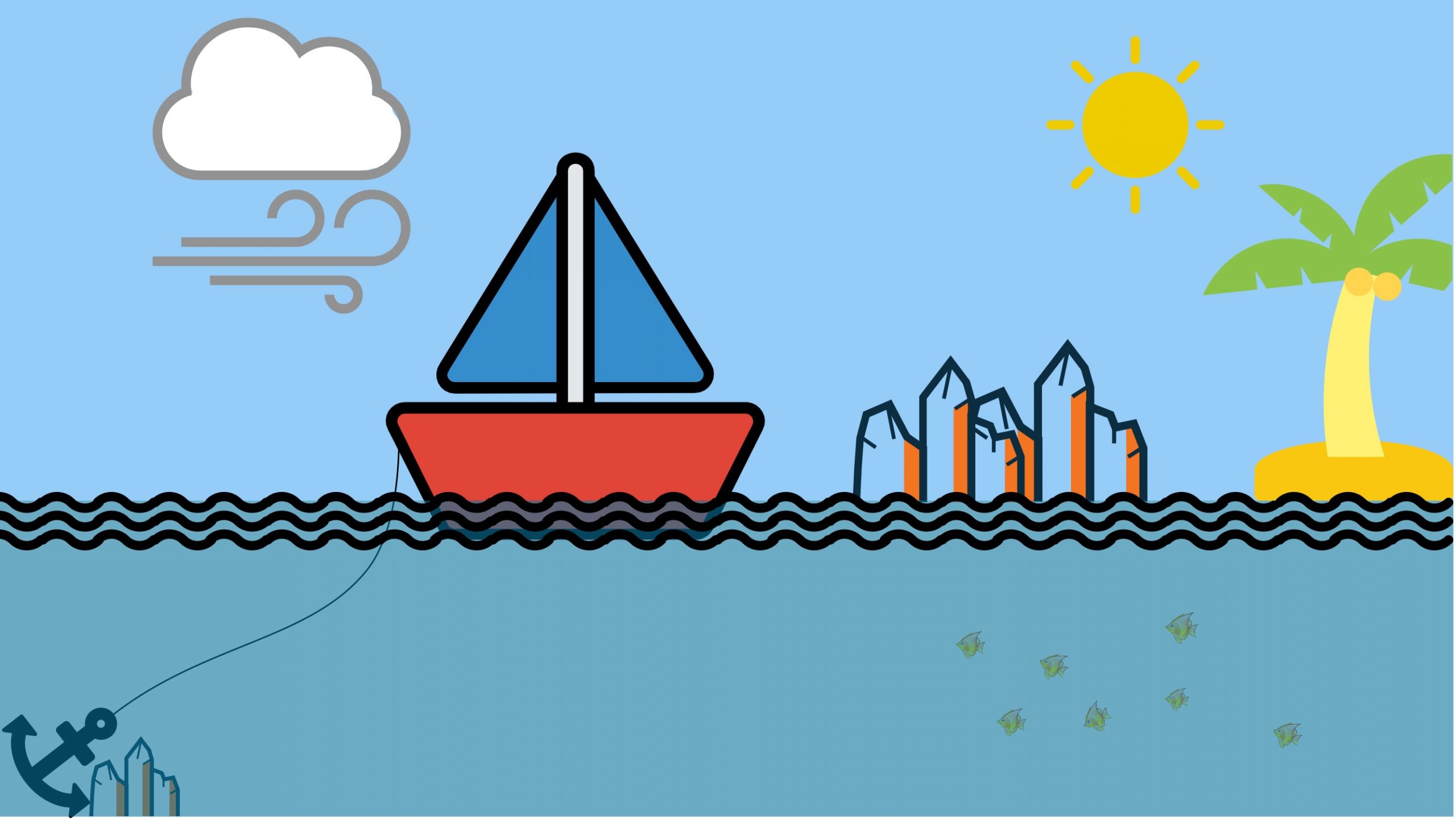
In the sailboat retrospective format, the boat represents the project or work we are doing; the wind is what is pushing us forward, the anchor what is holding us back. The rocks are dangers/risks we face, and the island is the goal or destination. I created this template in Miro.
In case you don’t know what that means, a retrospective (or a ‘retro’ for short) is a meeting-come-workshop where you look back on work you’ve done, as a team, and try to identify ways you could be better in future.
In agile methodologies, you can hold retros pretty regularly. With Scrum, you’d hold one at the end of every sprint – typically every 2 weeks – so you can get feedback quickly and adjust course immediately.
Think guiding a canoe through rapids; if you can’t change course quickly, you are going to hit a rock (a fairly common metaphor for retros uses a sailboat, as above) pretty soon, and pretty fatally.
Service landscape maps depict the different stages users go through when accessing a service as connected blobs, with the activities they do as circles within those blobs. It also captures who the external users are – the end users of the service and those who act in their support – the things users do to achieve their goals, the teams of people who deliver the service and are granted some power or authority within the system, and supporting organisations that also have a role to play in meeting user needs.
Services rarely, if ever, exist in a void. They exist within a context. A landscape.
Service landscape maps capture and illustrate that wider context and allow us to see the complexity at play, and to develop a better understanding of the user’s whole experience.
As a content author myself – I am, actually writing this, with fingers – I know it can be hard to choose how to provide alternative text for non-text content.
Do you go full-on and launch into a full description of the image? Or is just a brief alt=”cat” sufficient?
Tree blossom
So, how would you choose to describe this image to someone who can’t see it?
I gave it a <caption>Tree blossom</caption>, and alt=”Delicate white tree blossom against a clear blue Spring sky”.
Is that perfect? Probably not.
I don’t pretend to understand the lived experience of people whose experience is not like mine.
She included some analytics data that seemed to indicate some significant improvements. But she only had 3 months’ worth of data, which makes it hard to draw any firm conclusions.
So we thought now, with a year’s worth of data, would be a good time to look back on what’s changed, what worked, and any opportunities for further improvement.
An accessible document is a document that people with a range of physical and cognitive impairments can read and understand.
An accessible document is, typically, also a document that people with no physical or cognitive impairments can read and understand better, and faster.
Also typically, an accessible document is easier for content authors to maintain. Because it uses tools that are baked in to Word and other MS Office applications to support accessibility and improve workflow.
So, here are some tips on creating accessible Word documents.
As a service designer, you spend half your working life engaged with people who have deep technical knowledge – developers, UX designers, solutions architects and so on – and the other half with people who know little or nothing about what it takes to design, build and maintain a successful digital service.
Get feedback early and often
So it’s probably not surprising that language from one of those domains leaches into the other. Which is fine, but not without its issues.
One area where it does cause problems is the difference between a prototype and a wireframe. So this post is an attempt to clear that up.
I’ve been a small part of a team working on a new digital service to help Scottish businesses prepare for Brexit.
PrepareforBrexit.scot is an effort from all the agencies and organisations in Scotland’s public sector to help equip our businesses with the tools they’ll need to anticipate and deal with any shocks caused by the UK leaving the EU.
Mostly, my focus has been on analytics, helping colleagues newly drafted into that area to get on top of their game.
The site launched on 1 November. The data should become richer over time.